Chris Seymour.

Designing a component library

UI Design
Design Principles

I developed a comprehensive component library in collaboration with a front-end engineering team, built on Chakra UI’s design system. This library features reusable, customisable components that integrate seamlessly with Chakra’s framework, prioritising consistency, accessibility, and performance. By utilising Chakra’s theming and responsive capabilities, we significantly boosted development efficiency. This foundation also paved the way for a future in-house design system.
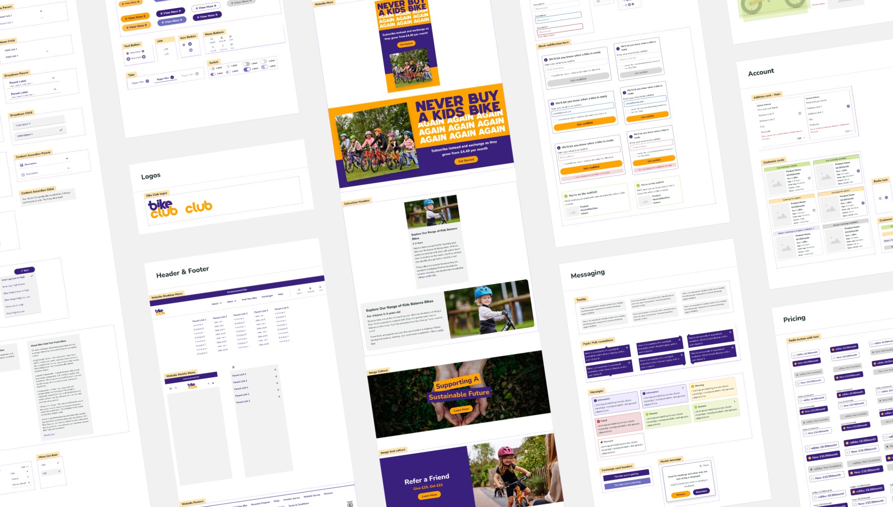
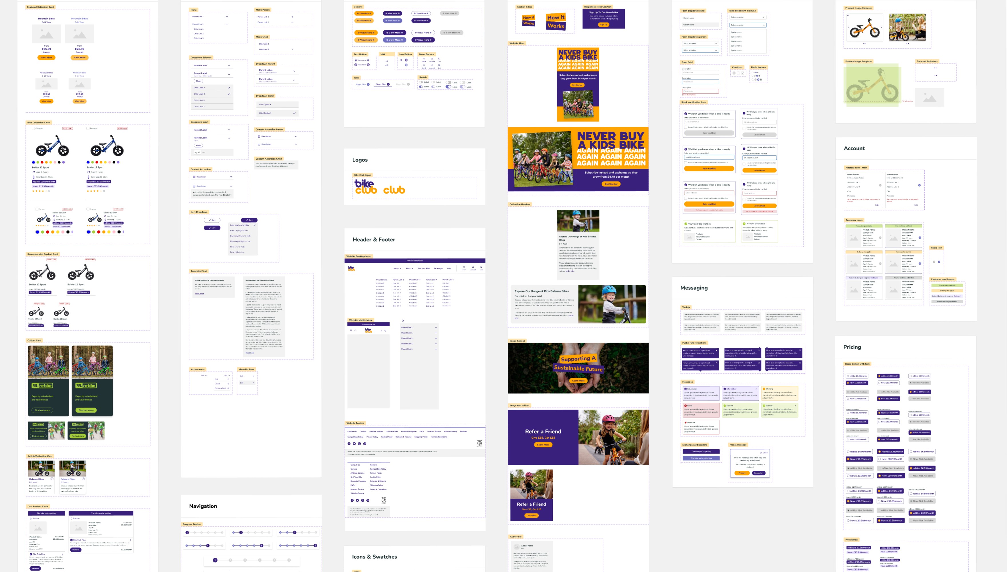
A layout displaying various components from Bike Clubs component library.

Defining the theme

The theme is the foundation of a cohesive visual identity, guiding the look and feel of an entire product. It defines key elements such as colours, typography, spacing, and component styles, ensuring consistency across all user interfaces.

The theme is the foundation of a cohesive visual identity, guiding the look and feel of an entire product. It defines key elements such as colours, typography, spacing, and component styles, ensuring consistency across all user interfaces.

The theme is the foundation of a cohesive visual identity, guiding the look and feel of an entire product. It defines key elements such as colours, typography, spacing, and component styles, ensuring consistency across all user interfaces.

Colour

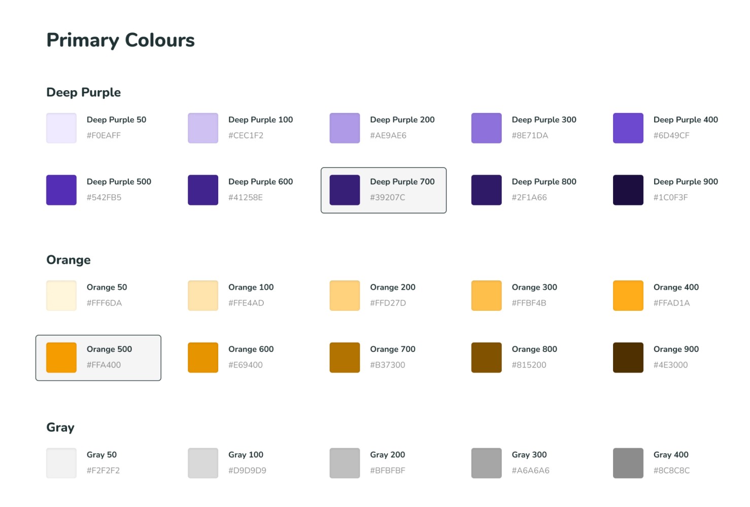
Tints of the primary brand colours were defined to provide a broad range of colours for varied use cases. Variables were created for these with design tokens documented where applicable.

Screenshot from a design system displaying various colour swatches of purple and orange and grey in a number of tints.

Typography

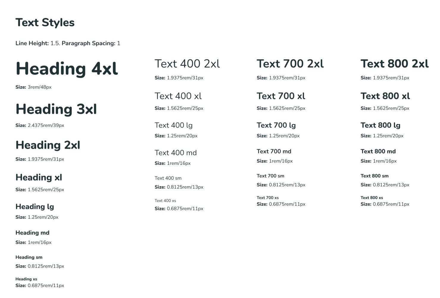
A size-based naming system was adopted for the typography similar to t-shirt size labelling. This approach allows for more flexibility when adjusting sizes globally, ensuring that design changes are easily managed without disrupting the overall visual hierarchy.

Screenshot from a design system of text styles displayed at different sizes and weights for xxs to 4xl.

Spacing

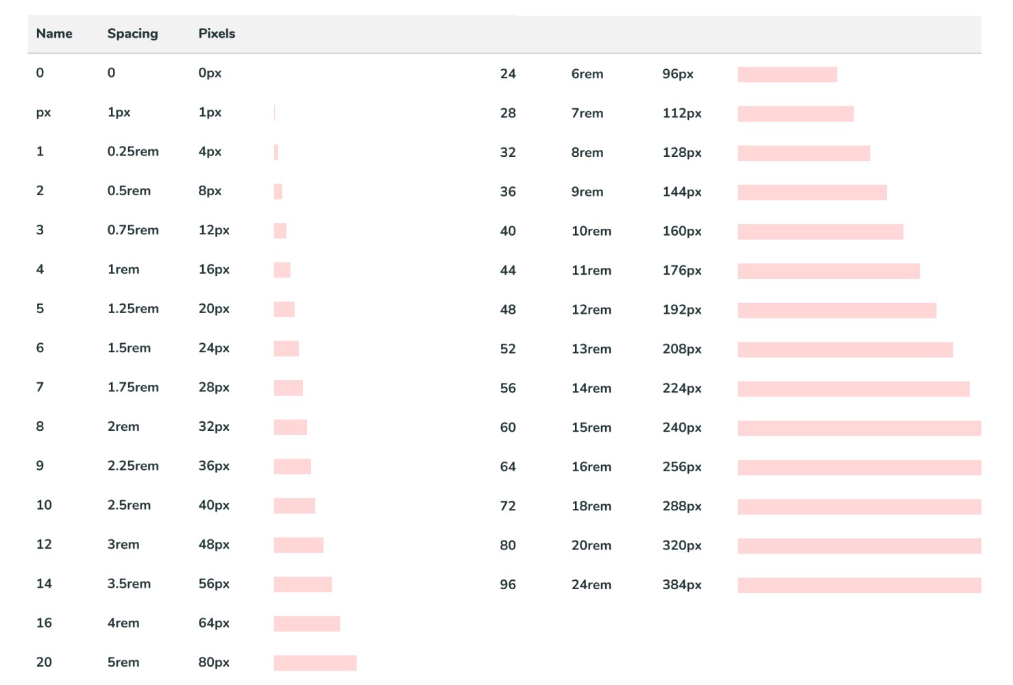
Leveraging the default spacing defined by Chakra UI ensured a harmonious and organised layout. Establishing consistent spacing ensures elements are evenly spaced, improving readability and visual balance across devices.

Screenshot from a design system of a spacing table showing both pixel and rem dimensions.

Breakpoints

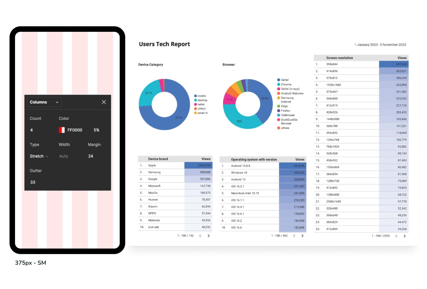
Using Google Analytics, we identified the most popular screen sizes among users browsing the website. The breakpoints ensured a responsive design to provide an optimal experience across different devices.

A mobile screenshot with an applied grid, alongside a Google Analytics chart displaying screen dimensions, browser types, and device information from website visitors.

Designing the components

Product Cards

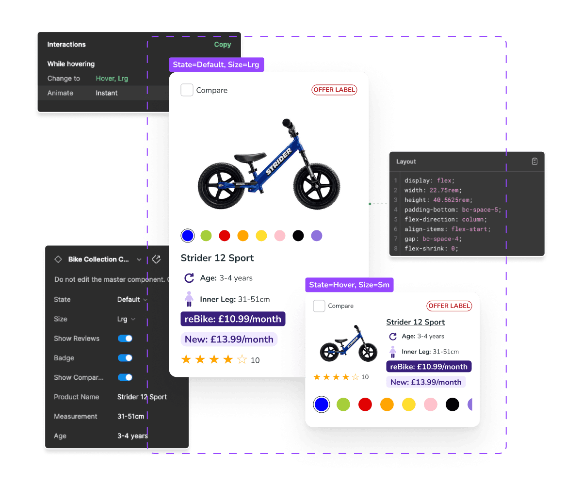
Product cards for listing pages were designed with nested components and editable properties, making them versatile for various use cases. I also created desktop and mobile variants, incorporating hover and tap state interactions.

Product Cards

Product cards for listing pages were designed with nested components and editable properties, making them versatile for various use cases. I also created desktop and mobile variants, incorporating hover and tap state interactions.

Product Cards

Product cards for listing pages were designed with nested components and editable properties, making them versatile for various use cases. I also created desktop and mobile variants, incorporating hover and tap state interactions.

Product card component with associated properties

Buttons

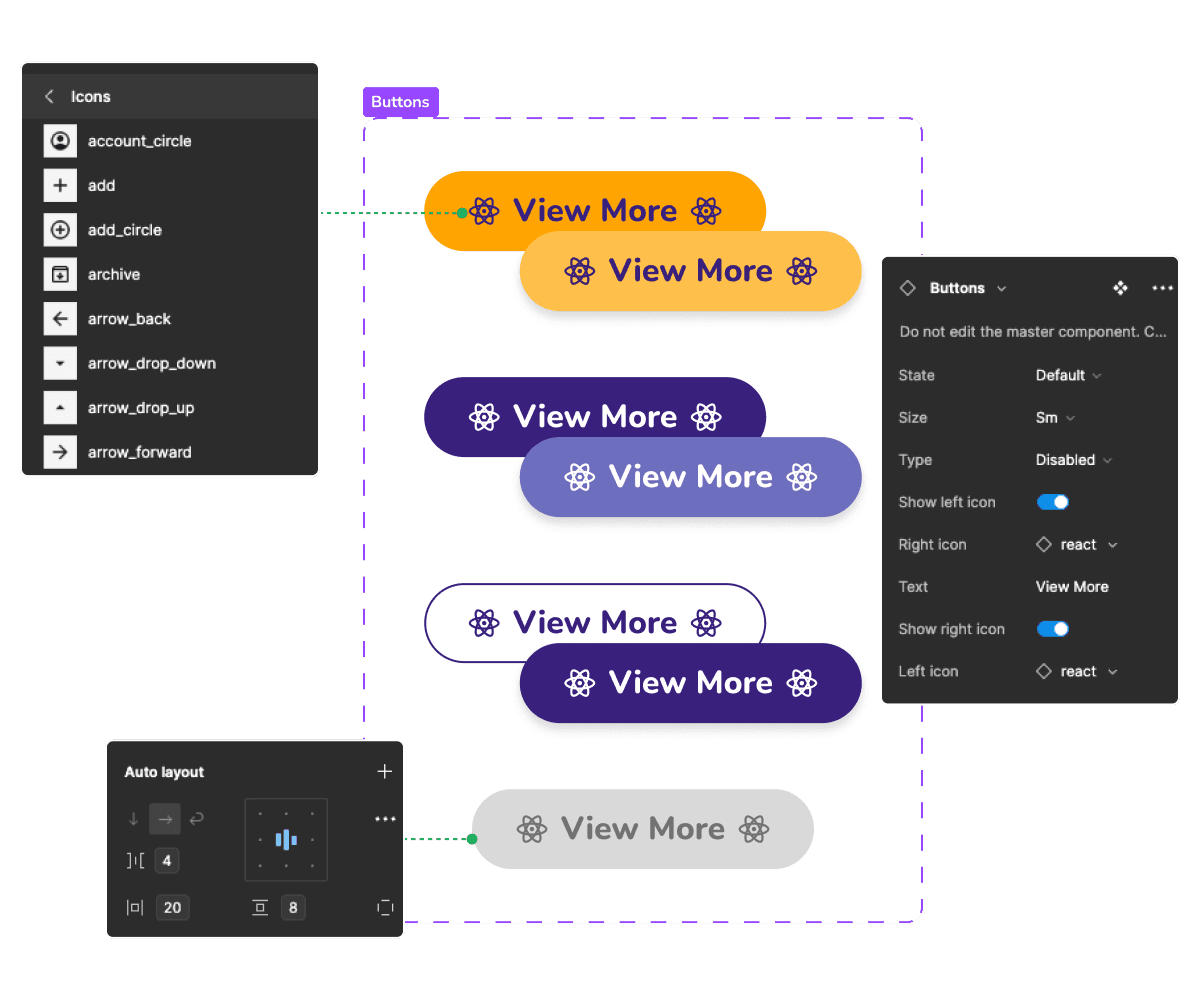
Primary, Secondary, and Tertiary button styles were created with boolean, text string, and instance swap variants, enabling easy customisation and consistency across the design. This approach streamlines design, ensures uniformity, and supports quick iterations.

Buttons

Primary, Secondary, and Tertiary button styles were created with boolean, text string, and instance swap variants, enabling easy customisation and consistency across the design. This approach streamlines design, ensures uniformity, and supports quick iterations.

Buttons

Primary, Secondary, and Tertiary button styles were created with boolean, text string, and instance swap variants, enabling easy customisation and consistency across the design. This approach streamlines design, ensures uniformity, and supports quick iterations.

Button component with associated properties

Forms

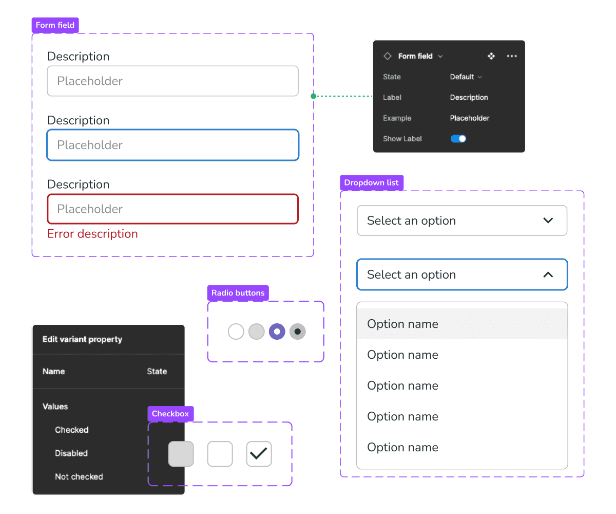
Form elements, including text fields, checkboxes, radio buttons, and dropdowns, were styled with built-in validation and accessibility features. These elements allowed developers to quickly build and maintain forms with a consistent look and behaviour.

Forms

Form elements, including text fields, checkboxes, radio buttons, and dropdowns, were styled with built-in validation and accessibility features. These elements allowed developers to quickly build and maintain forms with a consistent look and behaviour.

Forms

Form elements, including text fields, checkboxes, radio buttons, and dropdowns, were styled with built-in validation and accessibility features. These elements allowed developers to quickly build and maintain forms with a consistent look and behaviour.

Form component elements with associated properties

Plus many more…

A screenshot of various web components

Copyright © 2024 Chris Seymour